Monday, June 3, 2013

Final

I believe that my most successful work was my Muhammad Ali Print. I developed my craft by exploring my carving capabilities when transferring my subject image to my carving template. My carving tools were essential in this process as it was important to choose the correct size to get the proper amount of detail in my image. These tools were also key in creating texture in my final print in both the subject and the background. I really wanted to focus on the emotion in the boxer's face. I wanted to show the elation and pride in the wake of victory. In order to do this I added very small detail in his facial expression to convey the intricacies of his feelings.
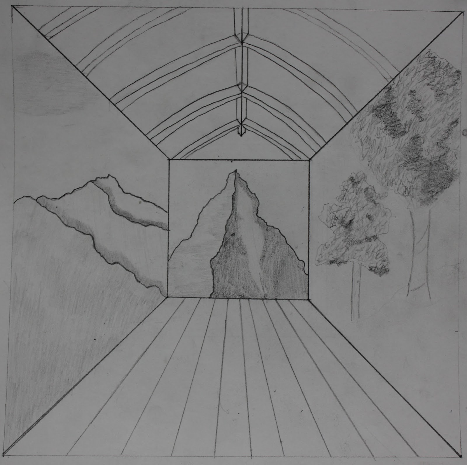
     I think that the most challenging project was my Tree Painting. This was most difficult because I really had to focus on proportionality and making things look real. This was definitely the most complex painting I have done so it took the most time and effort to complete. The final work is much more developed than my preliminary ideas. While my first effort had the basics of the image, I spent a lot of time developing the shadows and depth of the painting. I made these changes in order to make the painting more cohesive and look more real to the viewer. One problem that emerged was keeping the shadows consistent with the perspective as well as keeping the vanishing points the same for all aspects of the image. I solved these problems by keeping my focus on these aspects as I made progress. I also altered some of the shadows to be more consistent with the lighting.
     I really feel that I have greatly improved my drawing ability. I think my final work shows this development in comparison to the beginning of the year. My ability to use line to convey meaning and form is loads better than it used to be. I also think that my ability to focus on composition as a whole has improved. Where I could focus on specific aspects of a drawing, I now am able to see how certain aspects of my painting work with other aspects to create a full composition. I think that the fullness of my ideas has improved greatly. I now delve deeper into my artwork and go further in developing an idea. My ability to see and draw from that sight has also improved. This final landscape project has helped me do that and keep a certain perspective in mind while drawing. All of this improvement has made me a much better artist. I am very proud of my development.


Friday, May 31, 2013

Landscape Final

     My intentions with this project were to combine my skills at creating depth using the one vanishing point technique with my representation of a landscape. I also intended to combine aspects of architecture and geometric shapes with natural, organic forms within nature. I came to understand nature as any representation of your visual observations from a certain vantage point or points. With this in mind I took to creating a piece of art that represented all of these aspects. I think that this work is representative of my artistic voice because it reinforced my tendency to use geometric shapes and more "industrial", manmade subjects. However, I also stretched myself by using natural subjects as a guide. I decided to use three different vantage-points side-by-side. I thought that this would create an interesting,  "trippy" composition, in which reality could be questioned. I also created a space that was "inside" using arches and beams to create a vaulted ceiling.
     I felt redeemed by the feedback from words like "trippy", "attention to shading" and "geometric and organic at the same time". From these responses, I can be sure that I was successful in representing my intentions, as shading and form were two of my main focuses. "Varying shades create texture" is a phrase that resonated with me because I was really working on using shading to create form in the trees and mountains. I think that this shading is a main way in which I developed my craft. At the beginning of the year, this area of my work was virtually non-existent and undeveloped. After a year of working, I  showed great improvement, which I am very proud of.
     I feel that I did stretch and explore in this project in my development of the architectural aspects and their contrast to the nature. The arches created a great sense of depth, and the "walls" were somewhat transparent, but their existence was unclear. I could have pushed myself specifically in my tree drawing. I feel like there is a bit of room to develop the trees specifically, as well as add more complexity to the drawing as a whole. I am proud of this work, and happy with the improvement that it shows when compared to the beginning of the year.

Tuesday, May 14, 2013


My understanding of landscape is any visual representation of a specific viewpoint, either natural or manmade.
I like the illusion created through the use of a single vanishing point. The depth created on a flat piece of paper is impressive. I am interested in exploring the change of vantage within a picture and the proportionality that comes with it. I also want to exploit the openness of the sides of my original architecture drawing to add some complexity to the drawing with some natural landscape.
I am not really sure where I am going specifically with this project, but I think I would like to create an architectural sketch of some sort and combine this in some way with the type of landscape painting that I have done previously. 
I feel that I tend to use geometric shapes in much of my art, and while I want to use some architectural aspects in this project, I would also like to challenge myself by incorporating amorphous landscape into my art. I think it will be important to work on my shading talent to improve this artwork and make it more realistic. 
I want the symmetry to focus the viewer's eyes in the center, and the focus lines to bring their eyes out form there to the landscape. 

Thursday, May 2, 2013

Print Making Final


In this project I was very focused on conveying the emotion and gesture captured within this photo. I enjoyed employing the help of printmaking because it made it easy to replicate the image, further reinforcing the power of the image. I started with a list of describing words such as elated, champion and supreme. I was then able to research images that embodied some of these adjectives. I managed to find a terrific image depicting Muhammad Ali in the wake of victory. I think that I could have added to the image by including other sorts of imagery that would further reinforce the meaning behind the image. However, I decided to focus my efforts on carving a linoleum plate with which I could print my images. I only used the linoleum plate for printing, but I feel that I was really able to focus on getting the plate the way I wanted it, and explore the different ways to achieve my final goal. I was able to get really fine detail on my carving, which proved to be difficult to achieve. During printing I realized that I could utilise the texture made by the cuts around my print to create a sort of framing that added to the thematic elements of my print. I think that my process folio shows my experimentation with the printing process, however most of my prints look extremely similar, so the variation from print to print might be difficult to observe. The most striking discrepancy was my experimentation with color, which was shown in my final work. I thought that the black ink was too boring, so I added color just to liven it up. In one I experimented with varying color within one print. I made the figure blue and the texturing purple.
I believe that I am good at Developing Craft, Envisioning, Expressing, Observing and Reflecting. I think that I could have done better Stretching and Exploring, as there are a couple aspects of my print that I could have added complexity to.
I felt extremely comfortable with the entire printing process. If anything, I would try to add complexity to the printing process, using different materials as well as printing techniques to further complicate my work.
I really think that the emotion that I felt from the image was conveyed in my carving, especially in the boxer's face.

Monday, April 15, 2013

In-Progress Reflection

Currently, I have printed several black and white, and one blue and red relief prints of Muhammad Ali. My carving was very successful. I think that the graphic image that I created conveys the gesture and feeling of triumph and victory which I desired. The prints are coming out nicely. I think I should focus on lessening my use of ink as some of the prints are over saturated. I am hoping to go in a direction of more color, possibly in a sort of Andy Warhol Pop art direction. Replication is a great method to create this. Also, I might add some sort of verbal representation of my image. Other than that, my prints are coming out as I expected, and are completely fulfilling my intentions. I was pleasantly surprised by the lines that printed along with my image. I believe that they added to the gesture that I created. I am very happy with the outcome of the project so far.

Thursday, February 28, 2013

Final Post


Throughout the painting process I became quite familiar with the practices of Hans Hofmann. I used what I learned to create an accurate representation of his work in my own style. Stylistically I was able to use color, composition, shape and texture to produce an image containing depth, style and intrigue. This intrigue comes to play through my use of a tri colored background. The borders of this background create a sort of path throughout the image leading from block to block. By covering these lines with multiple colors of rectangles, I vary the contrast of colors, and give the viewer something to look at through the objects in the foreground, further adding to the depth of my painting.
When I first began, I placed emphasis on my color choice and how that would provide depth and contrast, however I found that the overlapping of boxes is more important to create motion. By varying the actions of the boxes I found ways to make them twist as a result of the actions of others. I felt comfortable choosing colors that interact well, however I believe that I could have been more careful lining up the edges of my rectangles, as some of them are slightly crooked. I believe that my color mixing expressed my style because I was able to control the streaking and toning of the colors. I really like how some of the boxes have different color variations as I believe it makes a more intriguing composition.
From this project I have learned that I express through vibrant colors. I am able to create good texture and perceive the effects of an aspect of my painting before adding that aspect. I think that this is important because it helps me establish a goal in my head and gives me the ability to successfully reach that goal. While there are some cosmetic flaws to the painting, I believe I was very successful in emulating Hans Hofmann, and I am very content with how my final product turned out.

Wednesday, February 13, 2013

          This is my painting so far. I still need to fill much of the empty space. I plan on shifting towards using more warm colors because Hofmann tended to stay within one color range. I also think that the crooked green rectangle at the bottom should be straightened out. I believe that I am headed in the right direction. With more color the painting will look more filled out and completed. I think that my final product will be a good emulation of the work of Hans Hofmann. I am very happy with my work so far.

Wednesday, January 23, 2013

Hans Hofmann Final

     After much research and experimentation on and around the works of Hans Hofmann, I have finally established my final intentions for this project. I plan on using a large canvas, which I have made, and creating a work similar to that of Hans Hofmann. I plan on using acrylic paint for my composition. Most of my experimentation was on a small scale, however I am excited to see what my composition will look like in larger form. My main focus is on the expression of color and color interaction. Because of this, it is important that I choose my color compositions wisely and take time to think about the placement of certain colors next to each other. One of Hofmann's main concerns was creating a sense of depth and space using only the contrast of color. My main goal is to accomplish this task in my painting.
     In my experiments I tended to create a solid background using only one color, however, I think it will be more interesting experimenting with a multicolored, streaked background, which is more similar to the work of Mr. Hofmann. I believe that this will add yet another element of depth and contrast to my composition. These color's must also be chosen carefully. I think that I will use Art Medium to thin the paint and create a more translucent wash for my background. The shape of my color blocks is also important. To keep them rectangular and straight I will employ the use of tape. Using pastels to experiment limited the amount of texture that I was able to capture, but paint will allow me to create a nice textured work. I hope to succeed with my intentions and create a composition that is both pleasing and intriguing.


My Works